What Eta Squared can tell us
Imagine a study, where students have to nominate the highest and lowest achiever from their class in mathematics — up to three names, including themselves. The rationale about such a question would be to investigate the salience of same-gender role models as a function of different experimential conditions. In your study, you would divide classes into same-gender groups and mixed-gender groups to investigate, whether this might have an impact on the nominations. You would collect some data and find that girls in the same-gender condition nominate 1.42 (SE = .24) high-math-ability girls, and in the mixed-gender condition 0.36 (SE = .23) girls. This result has been indeed found in a study by Huguet and Régner (2007, page 554). What do you think, would be the explained variance (\(\eta\)2) of the experimental condition (same vs. mixed-gender) on the number of nominations in an ANOVA on such data? Would it be around 1-10%, 10-20%, 20-30% or 30-40%?
To help you, let’s visualize the data in a common, but infamous plot, the so called “dynamite plot”:
library(lsr)
library(yarrr)
library(DescTools)
library(dplyr)
library(tidyr)
library(ggplot2)
library(kableExtra)

library(gganimate)
library(treemapify)#devtools::install_github("wilkox/treemapify")
dynamite <- data.frame(group = c("mixed","same"), mean = c(1.42, 0.36), SE = c(.24, .23))
ggplot(dynamite, aes(x = group, y = mean, fill = group)) +
geom_bar(position = position_dodge(), stat = "identity") +
scale_fill_manual(values = c("#4D4D4D","#B3B3B3")) +
geom_errorbar(aes(ymin = mean-SE, ymax = mean+SE), width=.2, size = 1.1, position = position_dodge(.9)) +
ylab("Nominations")+
theme_bw() +
guides(fill = FALSE)+
theme(axis.text = element_text(size = 20)) +
theme(axis.title = element_text(size = 20))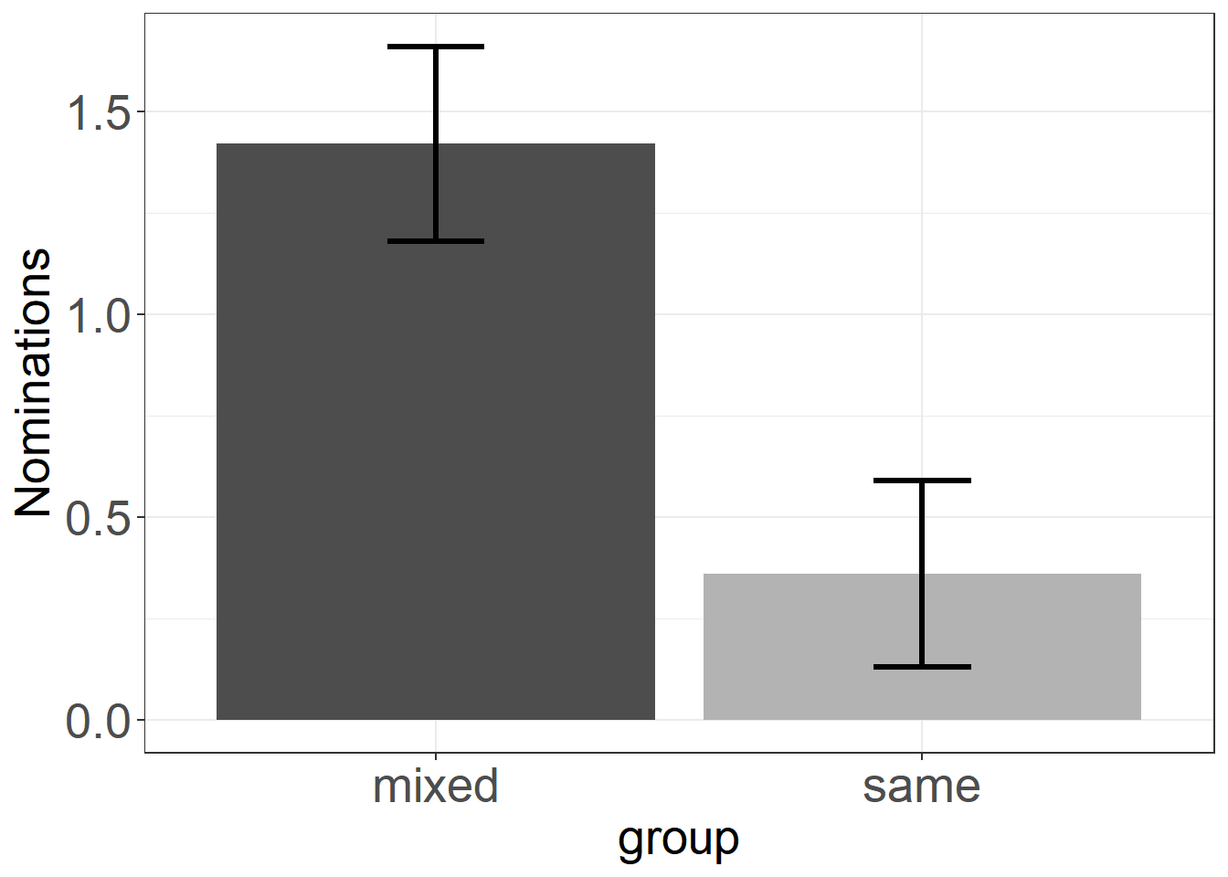
We see that the groups seem to differ quite a lot, but we do not see anything else than we already knew from the statistics of the mean and standard error above. Still, such plots are widely used in academia, even though their information can be displayed in a table with two rows (means and standard errors). A Hint: Do not use such plots, and try to ban them from papers you are writing or reviewing (see this post).
Now enough suspension, to unravel the magnitude of explained variance. Huguet & Régner (2007) reported the following result for their ANOVA:
F(1,216) = 8.92, p < .003, \(\eta\)2 = .04.
So, the experimental condition explains a mere 4% of the variance in the data. If this value of \(\eta\)2 surprises you, you are not alone. While the mean difference supposes a rather clear difference between the groups, I also wondered, why eta squared was thus small. Also the large F-value, that results from the division of the Mean Sum of Squares between the groups by the Mean Sum of Squares within groups was high, suggesting a large ratio of between- to within-group variance. I could not come up with a good explanation of this seemingly inconsistent result, and thus I tried to get a feeling on how \(\eta\)2 behaves in similar cases to the ones the authors reported. As I could not get my hands on the original data, I just simulated some data that resembles the dataset used in the study at least by the mean and sample size. The mean and the standard errors are summarized in the following table:
set.seed(2616)
n <- 218/2  # assuming, both experimental groups are equally large

mixed <- rnorm(n, mean = 1.42, sd = sqrt(n)*.24) #simulate sample from a normal distribution with the respective mean and standard deviation
same <- rnorm(n, mean = .36, sd = sqrt(n)*.23)

dt <- data.frame(group =c("mixed","same"), Mean=c(mean(mixed), mean(same)), Standard_Error =c(MeanSE(mixed), MeanSE(same)))
dt %>%
  kable()%>%
kable_styling()| group | Mean | Standard_Error |
|---|---|---|
| mixed | 1.4225076 | 0.2553378 |
| same | 0.3614901 | 0.2208642 |
This adequately resembles the mean structure that we want to see. What does this data look like? Let’s use pirateplots from the yarrr-package, as a much better alternative to dynamite plots:
df <- data.frame(group=c(rep("mixed",n),rep("same",n)), value=c(mixed, same))
pirateplot(value ~ group, data=df, cex.lab=1.6)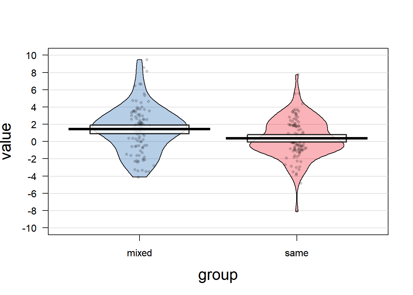
Interestingly, the data is scattered stronger than one might think when only looking at the mean and standard error reported in the study (regard the scale of the plot!). It is not a perfect simulation of the data that was used in the original article, because negative nominations are not possible. That might indicate, that the authors did not use the appropriate distribution and should have used the Poisson distribution for count data instead. However, for the sake of simplicity, we will stick with using normally distributed data.
May the small \(\eta\)2 just be due to an error in the analysis? Let’s look whether the ANOVA result on the simulated data resembles the statistics reported in the article:
mod1 <- aov(df$value ~df$group)
summary(mod1)
etaSquared(mod1)
Our F-value is even a little larger, and \(\eta\)2 is close around what Huguet & Régner (2007) report in their article. Thus, we can be sure that there is nothing wrong with their reported statistics, as it is indeed a rather strong mean difference and a rather small amount of variance explained. My colleague Peter Edelsbrunner told me that there is also a formula on recalculating the effect size out of the F-value and the respective degrees of freedom, because \(\eta\)2 can be expressed as a function of the inferential statistics. You can find the tool here, but this only applies for factors that can really be experimentially manipulated (unlike gender). Yet, what still irritated me was the perceived strong difference in means compared to the small amount of variance explained. What does \(\eta\)2 tell us then?
Let’s look, at how else we could describe this data. As it is only two groups, Cohen’s d is also a possible measure for the effect size:
CohenD(mixed, same)## [1] 0.4257092
## attr(,"magnitude")
## [1] "small"A Cohen’s d around .4 can be considered small to medium (according to old conventions, but see this conference presentation), and I would admit that this looks better than an explained variation of 4%. What would it look as a correlation?
cor(df$value, as.numeric(df$group)) ## [1] -0.2091103Squaring this term would exactly lead to our eta-coefficient: r2=0.0437271. This will only be true in the case that the independent variable consists of two groups. When there are more than two groups, then the two measures will only be equal, if the relationship between the variables is a linear one. If there is a non-linear relationship, then the difference between \(\eta\)2 and R2 indicates non-linearity (Richardson, 2011). That is, in the case of a dichotomous independent variable, \(\eta\)2 is the direct analogue measure of the determination coefficient R2 in regression analysis and can be interpreted in the same way. But wait, how would explained variance look like in the context of an ANOVA example?
How could we visualize the explained variance?
Visualizing variance, and even more so explained variance, is a tough attempt. A very nice visualization of explained variance was developed by W.J. Schneider here, but unfortunately it does not cover the explained variance in an ANOVA example. Thus, I started with an own visualization of the data that we already have so far.
df <- df %>%
  # group_by(group) %>%  # actually, we do not need the within variance, but total variance
  mutate(grandmean = mean(value)) %>%
  mutate(diff = value - grandmean) %>%
  group_by(group) %>%
  mutate(groupmean = mean(value)) %>%
  ungroup()

pd = position_dodge(.01)
ggplot(df, aes(x=0, y=value, col=group))+
  geom_point(alpha=.3, pos=pd, size=1.7)+
  geom_hline(size=1.1, aes(yintercept=grandmean), linetype="dashed")+
  xlim(-.2,9)+
  coord_fixed()+
  theme_bw()+
geom_text(aes(x=7.3, y=0.6), label="Grand Mean",size=3.8, col="black",
          fontface="bold")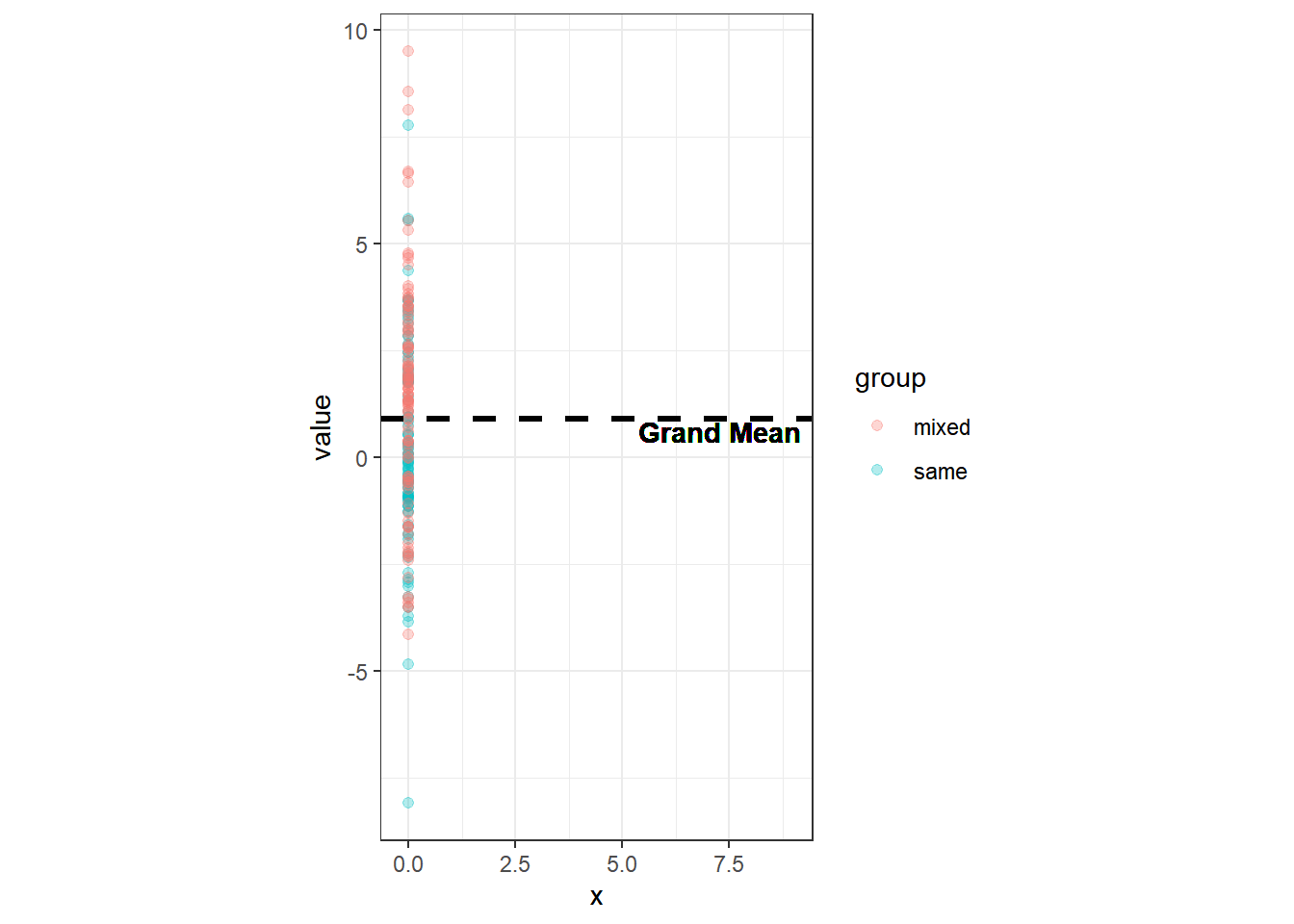
We can plot the data from both groups on the same line and calculate the mean of all values together, the so called Grand Mean. That would be the mean across all groups. The total variation of the values is the deviation of all values from this Grand Mean. This total variation can be decomposed into systematic variation — how values vary systematically between the groups — as well as into unsystematic variation — how values vary randomly within a group (i.e. error variance).
The variance for the population is defined as: \[\hat{\sigma}^2 = \frac{(x_i - \hat{\mu})^2}{N - 1} = \frac{SS}{N - 1}\] You might know that SS stands for Sum of Squares, and that it is possible to visualize them by squaring the residuals; e.g. from a regression line. By drawing the distance between a value and the mean, and then squaring this term, we get these Sums of Squares. The squaring can be shown by adding a line that is perpendicular to the first and has the same length. Let’s add these squares:
ggplot(df, aes(x=0, y=value, col=group))+
  geom_rect( aes(ymin=grandmean, ymax =value, xmin = 0, xmax=0+abs(diff)),
             color="black",fill="darkgray", alpha=.2) +
    geom_point(alpha=.3, pos=pd, size=1.7)+
    geom_hline(size=1.1, aes(yintercept=grandmean), linetype="dashed")+
  theme_bw()+
coord_fixed() 
The area of all those squares would be the total Sum of Squares as a measure for the total variation. Let’s now add the systematic variation. First we need to calculate the mean of every group. The systematic variation is the difference from these means to the Grand Mean (multiplied by group size). We can visualize this systematic variation in a similar way:
ggplot(df, aes(x=0, y=value, col=group, fill=group))+
  geom_rect( aes(ymin=grandmean, ymax =value, xmin = 0, xmax=0+abs(diff)), color="black", fill="darkgray",alpha=.2) +
    geom_hline(size=1.1, aes(yintercept=grandmean), linetype="dashed")+
    geom_point(alpha=.3, pos=pd, size=1.7)+
  theme_bw()+
  coord_fixed()+
    geom_rect(aes(ymin=grandmean, ymax=groupmean, xmin=0, xmax=0+abs(grandmean-groupmean)), color="black",alpha=.06) +
  geom_segment(aes(y=groupmean, yend=groupmean, x=0, xend=5), size=1.4, linetype="longdash" )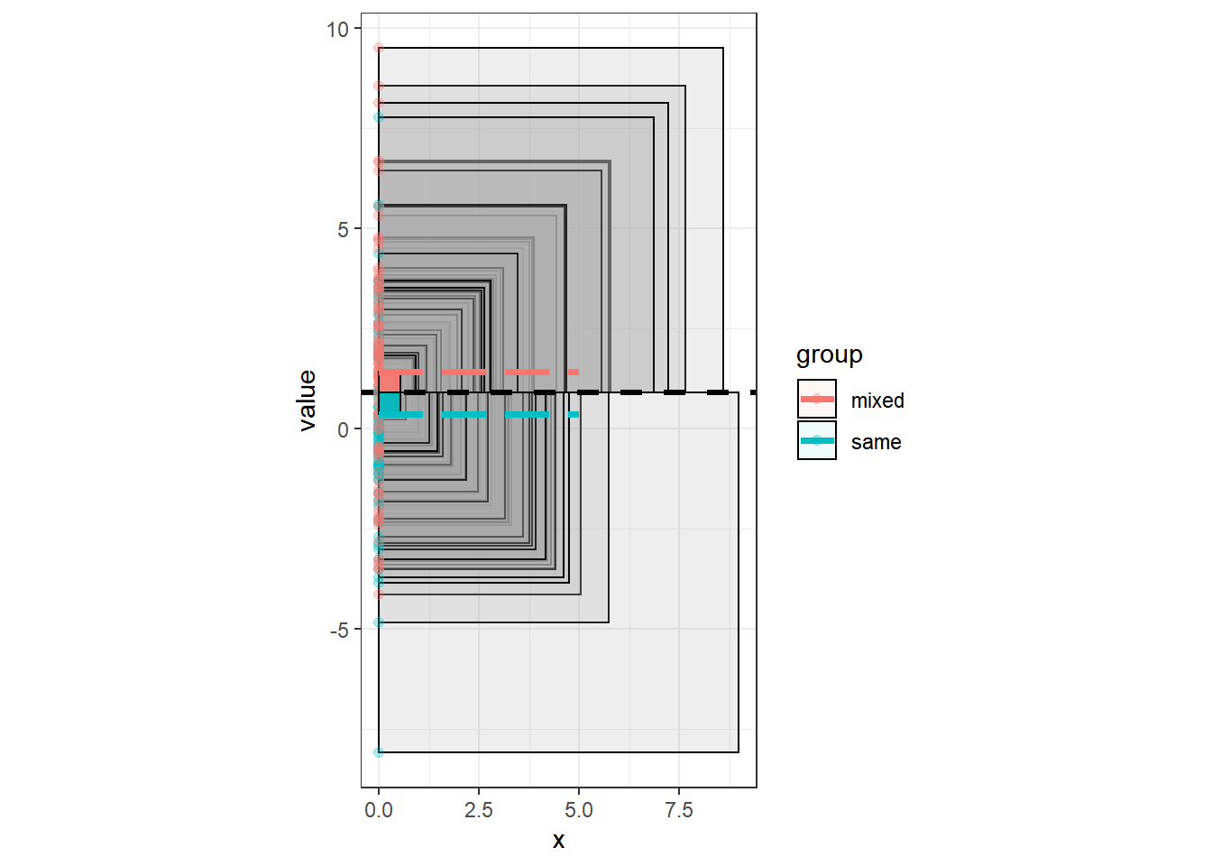
At this moment, there is a lot of overlap of the squares, and also the multiplication of the systematic variation (SS_between) with the group size is not visible. Thus, we will now add up all the squares and plot them beside each other.
Altough there is a lot of overlap on the boxes, and we have to imagine that the systematic variation gets multiplied by group size, we see already, that the area of systematic variation is much smaller than the area of the total variation. This can also be achieved mathematically and would lead us to the following ratio of between variance to total variance:
areas <- df %>%
  ungroup() %>%
  mutate(diff_2 = diff^2) %>%
  summarise(area=sum(diff_2)) # total variation
total <- sum(df$diff^2)

# SS between is the squared difference of groupmeans to grandmean multiplied by group size
grandmean <- unique(df$grandmean)
between <- ( (mean(mixed)-grandmean)^2 + (mean(same)-grandmean)^2  ) * n

between/total
## [1] 0.04372711Which leads us again exactly to our calculated \(\eta\)2. The relation of the area would look like the following:
ggplot( ) +
  theme_bw()+
  coord_fixed()+
  geom_rect(aes(xmin=0, xmax=sqrt(total),ymin=0, ymax=sqrt(total)), color="darkgray", alpha=.2)+
  geom_rect(aes(xmin=0, xmax=sqrt(between), ymin=0, ymax=sqrt(between)),fill ="skyblue",alpha=.6)+
  geom_text(aes(x=3.8,y=4), label="explained variance", size=3.2, col="darkblue", fontface="bold") +
  geom_text(aes(x=18, y=19), label="unexplained variance",size=7.8, col="#999999", fontface="bold")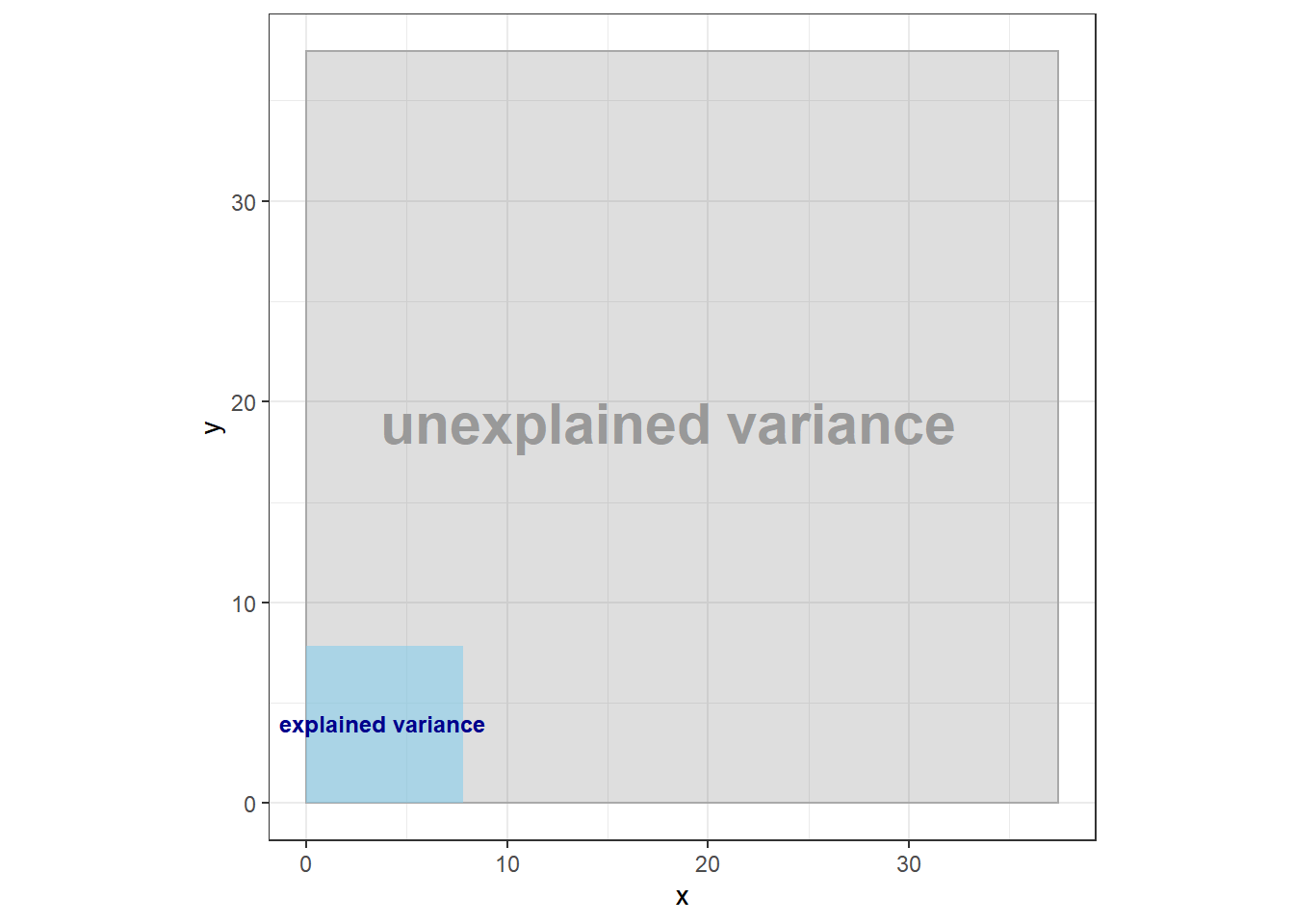
So what on earth does eta squared tell us?
We have now visualized \(\eta\)2 in terms of the explained variance, but still it is not clear, how to interpret the values of \(\eta\)2 and why they do differ so much from other effect sizes like Cohen’s d. To develop a feeling for the “behavior” of \(\eta\)2, I simulated data for two groups with different mean differences and sample sizes with the research question: “How is \(\eta\)2 distributed across different effects?” I simulated 1000 datasets with varying sample sizes (N=30, 50, 100, 250, 500) and varying mean differences (Cohen’s d = 0.00, 0.10, 0.30, 0.50, 1.00) to investigate the relation between Cohen’s d and \(\eta\)2.
final_df <- data.frame(d=numeric(25000), n=numeric(25000), i=numeric(25000), Fval=numeric(25000), sign=numeric(25000), eta=numeric(25000), cohen=numeric(25000))

count <- 1
for(d in c(0,.1,.3,.5,1)){ # vary mean difference (cohen's d)
  for(n in c(30,50,100,250,500)){ # vary sample size of both experimental groups
    for( i in 1:1000){ # 1000 times


  KG <- rnorm(n, mean=0, sd=1) #simulate sample from a standard normal distribution
  EG <- rnorm(n, mean=0+d, sd=1)

  temp_df <-data.frame(group=c(rep("KG",n),rep("EG",n)), value=c(KG, EG))
  mod2 <- aov(temp_df$value ~ temp_df$group)
  Fval <- unlist(summary(mod2))["F value1"]
  sign <- unlist(summary(mod2))["Pr(>F)1"]
  eta <- etaSquared(mod2)[1]
  cohen <- CohenD(EG,KG)[1]

  final_df[count,] <- c(d,n,i,Fval, sign, eta, cohen)
 count <- count+1
    }}}

#extract the following: d, n, i, F, significance, eta,  cohenD
ggplot(final_df, aes(x=cohen, y=eta, color=Fval))+
#geom_jitter(width=.01)+
geom_point(alpha=.2)+
facet_wrap(~n)+
scale_color_viridis_c(name="F value")+
ylab("eta squared")+
#ylim(-1,2)+ coord_fixed()+
#facet_wrap(~n, scales="free_x")+ #
theme_bw()
  # ggplot(final_df, aes(x=Fval, y=eta))+
  #   geom_point()+
  #   geom_smooth()+
  #   facet_wrap(~n)+ #very interesting!
  #   theme_bw()  # non-linear relation?
  #
  # ggplot(final_df, aes(x=n, y=eta))+
  #   geom_point()  #interesting
We can see a strong relationship between Cohen’s d and \(\eta\)2 that seems to be linear except when it is near 0 — the u-shape comes from the fact, that while Cohen’s d can take negative values, eta squared is always positive, and gets larger for values of d that are farther away from 0. We can also see, that Cohen’s d is normally larger than \(\eta\)2. Furthermore, there is an upper bound of eta, that is far lower than 1, which would be the logical maximum. In fact, \(\eta\)2 would be 1, only if all values within a group are the same (e.g. in the mixed-gender condition, everyone nominates 3 members, in the same-gender condition, everyone nominates 2). If the values are not all the same, but normally distributed, the upper bound for \(\eta\)2 is at .64 (Pedhazur, 1997 in Richardson, 2011). In our simulation \(\eta\)2 hardly ever exceeds .5, and its average value for the different sample sizes and Cohen’s d is given in the next table.
tb <- final_df %>%
  dplyr::group_by(d,n) %>%
  dplyr::summarise(mean=mean(eta)) %>%
  mutate(mean=round(mean,3)) %>%
  spread( n, mean)

tb %>%
  kable() %>%
  kable_styling(bootstrap_options = "striped") %>%
  column_spec(1, bold = T, border_right = T) %>%
add_header_above(c("Cohen's d", "Sample size (N)" = 5))| d | 30 | 50 | 100 | 250 | 500 |
|---|---|---|---|---|---|
| 0.0 | 0.016 | 0.010 | 0.005 | 0.002 | 0.001 |
| 0.1 | 0.018 | 0.013 | 0.008 | 0.004 | 0.004 |
| 0.3 | 0.037 | 0.033 | 0.028 | 0.024 | 0.023 |
| 0.5 | 0.076 | 0.071 | 0.064 | 0.060 | 0.060 |
| 1.0 | 0.215 | 0.210 | 0.204 | 0.202 | 0.200 |
Interestingly, the mean and upper bound of \(\eta\)2 seem to decrease with larger samples. While in large samples the F value easily exceeds 100, which is not the case in samples with 30 or 50 participants per group, Cohen’s d as well as \(\eta\)2 have a smaller range in larger samples. Thus, the u-shaped curve for N of 500 looks like a snippet of the curve for an N of 30, as the variation is larger in smaller samples.
When there is no true effect, \(\eta\)2 might still yield values that would be counted as an effect. For example, when comparing it with the rule of thumb, that \(\eta\)2 = .06 would mean a medium effect, in 10.29% of the cases, \(\eta\)2 would count as a medium effect, while the true effect is zero; but this is mostly the case in smaller samples.
So far, we have now investigated how Cohen’s d and \(\eta\)2 are related in a unifactorial ANOVA with two groups. We have seen that there is a strong relationship, but also that \(\eta\)2 is smaller than Cohen’s d and that it has an upper bound. To help researchers to compare their values of eta squared against some common magnitudes, also some benchmarks have been developed, that suggest, what counts as a small, medium and large effect.
Where do the margins .01 = small, .06 = medium, .14 = large come from?
Probably you have read or heard about such rules of thumb that an \(\eta\)2 > .06 would count as a medium effect. Such suggestions for magnitudes of effects exist for most measures of effect sizes, and many of them stem from Jacob Cohen. He brought out a whole book on power analysis (Cohen, 1969) and in this referred to the magnitude of effect sizes, that researchers can expect to find, as a last resort when they do not have better estimates, which effects exist in a certain field (Correll, Mellinger, McClelland, & Judd, 2020). These rules of thumb are often cited and widely used, however, most people do not know, where they come from.
Cohen often used standard deviations to examine effect sizes, and for ANOVAs he created a measure called \(f\), which is, simplified, the standard deviation of the population means of the groups (Richardson, 2011). For this measure \(f\), Cohen postulated borders of .10, .25 and .40 meaning small, medium and large effects. As \(f\) can be translated into eta squared, the corresponding values of \(\eta\)2 would be .0099, .0588, .1379 (Richardson, 2011). Later, researchers omitted mentioning \(f\), as a measure for which these boundaries were developed and rounded the values to two decimal places, probably because four decimal places would imply a too high precision.
There is a dispute about the interpretation of effect sizes using the rules of thumb for small, medium, and large effects — a distinction that Correll, Mellinger, McClelland and Judd (2020) coined the “t-shirt approach”, as these categories suggest to be distinct standards to categorize effects. On the one hand, researchers state that nothing is wrong with using such rules of thumb as benchmarks, especially, when an effect has not been studied much in literature. Also, some older reviews (Cooper, & Findley, 1982; Haase, Waechter, & Solomon, 1982; in Richardson, 2011) found that Cohen’s benchmarks on the explained variance do quite a good job, at least in social psychology and counselling psychology. They reviewed studies and found average values of the effect size lying around the values that were suggested by Cohen. On the other hand, newer reviews suggest that the median effect sizes for example in experimental cognitive psychology might even be higher than what Cohen suggested (Schäfer & Schwarz, 2019). Furthermore, Cohen’s rules of thumb are inconsistent across different effect size measures (such as Cohen’s d, \(\eta\)2 and r; see Correll et al., 2020). Thus, keep in mind, that these magnitudes were suggested arbitrarily and do not imply an absolute truth for your research field. Also keep in mind, that Cohen only referred to partial \(\eta\)2, but nowadays the magnitudes are used for \(\eta\)2 as well.
Other estimates for the explained variance in ANOVAs
As Daniel Lakens nicely summarized here, \(\eta\)2 is biased and overestimates the explained variance in the population (Leonhart, 2009). Thus, other indices have been developed, to capture the population variance more accurately:
- \(\epsilon\)2 (Kelley, 1935 )
- \(\omega\)2 (Hays, 1963)
- \(\hat{\omega}\)2 (Olejnik & Algina, 2003)
However, whereas \(\eta\)2 tends to overestimate the variance in the population, the older alternative measures (\(\epsilon\)2 and \(\omega\)2) instead tend to underestimate the variance in the population, but to a smaller extent, as Lakens points out.
\(\hat{\omega}\)2 tries to solve these issues, and has been developed with the idea, to be independent of the research design. In R the older alternative measures are implemented within the sjstats package (Lüdecke, 2019) via the functions omega_sq() and epsilon_sq(). As of now, \(\hat{\omega}\)2
is not implemented in R and remains a less known measure — \(\eta\)2 is used in almost all cases (Richardson, 2011).
Concluding remarks
We have now investigated the behavior of \(\eta\)2 and compared it to other effect size measures. We have seen, that \(\eta\)2 differs quite a lot from other effect sizes in magnitude, and we visualized what it means in terms of variance decomposition. Note, that these scenarios above only considered ANOVAs with one independent variable/factor. Estimating the (partial) \(\eta\)2 for ANOVAs with multiple factors or with covariates (ANCOVAs) is more complex and not discussed here, because variance decomposition in those cases is less clear (Richardson, 2011). This makes it also difficult, to compare results from various designs.
As Richardson (2011) pointed out — despite its wide use — the interpretation of \(\eta\)2 as well as partial \(\eta\)2 has to be done carefully. First of all, there has been a vast confusion about \(\eta\)2 and partial \(\eta\)2, as for example SPSS did not use the correct term up to version 10. Furthermore, partial \(\eta\)2 depends on the inclusion and exclusion of other factors. Secondly, the term explained variance might also be misleading, as we did not explain anything with this measure. It is simply a ratio, that tells us, what proportion in the variation of the dependent variable is associated with falling in one of the groups of the independent variable (Richardson, 2011).
References
- Cohen, J. (1969). Statistical power analysis for the behavioural sciences. New York: Academic Press.
- Correll, J., Mellinger, C., McClelland, G. H., & Judd, C. M. (2020). Avoid Cohen’s ‘Small’,‘Medium’, and ‘Large’for Power Analysis. Trends in Cognitive Sciences.
- Hays, W. L. (1963). Statistics. New York: Holt, Rinehart, & Winston.
- Huguet, P., & Regner, I. (2007). Stereotype threat among schoolgirls in quasi-ordinary classroom circumstances. Journal of educational psychology, 99(3), 545.
- Kelley, T. L. (1935). An unbiased correlation ratio measure. Proceedings of the National Academy of Sciences, 21, 554–559. - Leonhart, R. (2009). Lehrbuch Statistik–Einstieg und Vertiefung (2., überarbeitete und erweiterte Aufl.). Bern: Verlag Hans Huber, 92.
- Lüdecke, M. D. (2019). Package ‘sjstats’.
- Olejnik, S., & Algina, J. (2003). Generalized eta and omega squared statistics: Measures of effect size for some common research designs. Psychological Methods, 8, 434–447.
- Schäfer, T., & Schwarz, M.A. (2019). The meaningfulness of effect sizes in psychological research: differences between sub-disciplines and the impact of potential biases. Frontiers in Psychology, 10, 1-13.
- Richardson, J. T. (2011). Eta squared and partial eta squared as measures of effect size in educational research. Educational Research Review, 6(2), 135-147.