The (un-)periodic table of Deaths in Shakespeare's plays

The periodic table has evolved as a great tool to gain overview across various types of categorical data that is grouped by some common characteristics. The periodic table of chemical elements is not only meaningful due to its content, but also due to its well-arranged framework.
Besides its original use in chemistry, there have been various other ideas for displaying categorical information in a periodic table, such as displaying different centrality indices from network analysis by David Schoch, or displaying the characters from Lord of the Rings.
Inspired by the work of Georgios Karamanis, who plotted the reign of Roman Emperors from 27 BC to 395 AD in a system that resembles the periodic system, I applied the system of the periodic table to another type of categorical data: the list of all character deaths in Shakespeare’s plays.
There have been attempts to summarise and visualize the cruel and dark parts of Shakespeare’s plays in plots like death clocks, posters or even songs. However, although there are various investigations on Shakespeare’s plays, none actually collected the number of deaths occuring in his plays.
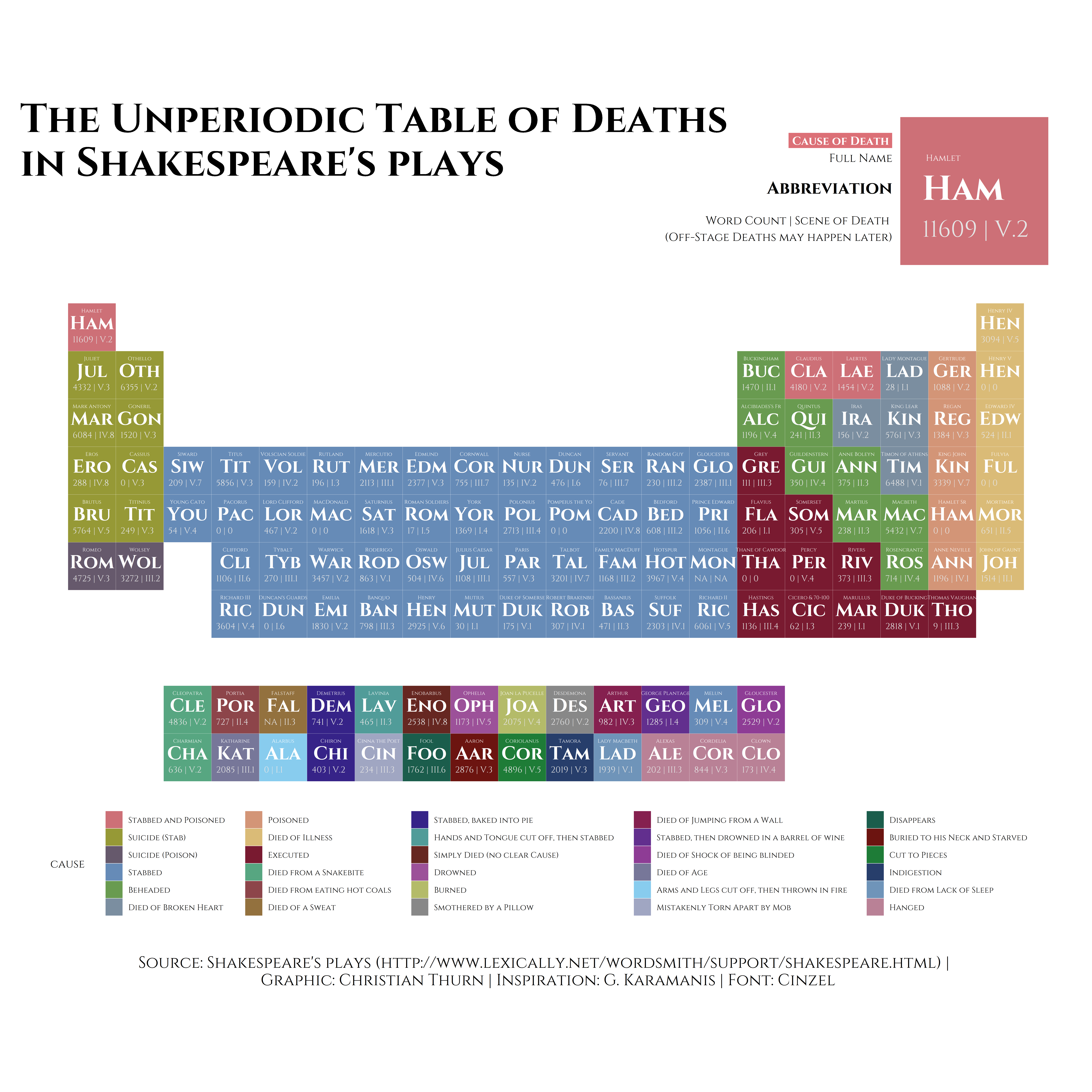
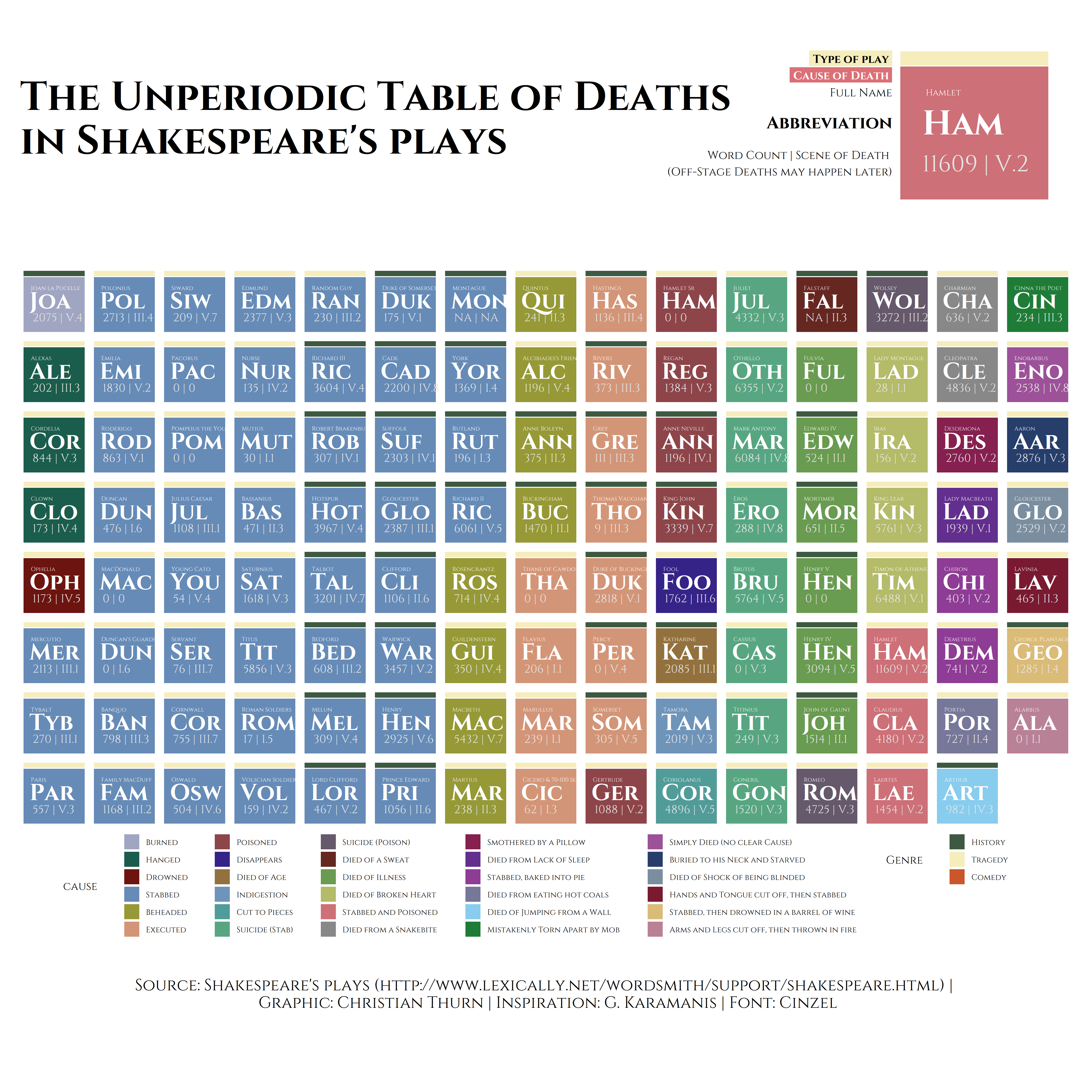
Thus, I aggregated the data by my own, using the data from lexically.net. I calculated the number of words per character and also the last scene, the character appears in. While for on-stage deaths this is indeed the scene of death, off-stage deaths might happen later and are only narrated to the audience but not shown.
library(tidyverse)
library(here)
library(lubridate)
library(glue)
library(ggtext)
library(rcartocolor)
library(cowplot)
library(extrafont)
library(stringi)
library(Rmisc)
library(ggrepel)
library(gridExtra)

library(tvthemes)
import_cinzel()
loadfonts()
####################
# Helper functions #
####################
# add two different scales and legends to ggplot
# https://gist.github.com/eliocamp/eabafab2825779b88905954d84c82b32
new_scale <- function(new_aes){ structure(ggplot2::standardise_aes_names(new_aes), class = "new_aes")}
# Convenient functions
new_scale_fill <- function(){ new_scale("fill")}
new_scale_color <- function(){new_scale("colour")}
new_scale_colour <- function(){new_scale("colour")}
# Special behaviour of the "+" for adding a `new_aes` object
# It changes the name of the aesthethic for the previous layers, appending
#' "_new" to them.
ggplot_add.new_aes <- function(object, plot, object_name) {
plot$layers <- lapply(plot$layers, bump_aes, new_aes = object)
plot$scales$scales <- lapply(plot$scales$scales, bump_aes, new_aes = object)
plot$labels <- bump_aes(plot$labels, new_aes = object)
plot
}
bump_aes <- function(layer, new_aes){ UseMethod("bump_aes")}
bump_aes.Scale <- function(layer, new_aes) {
old_aes <- layer$aesthetics[remove_new(layer$aesthetics) %in% new_aes]
new_aes <- paste0(old_aes, "_new")
layer$aesthetics[layer$aesthetics %in% old_aes] <- new_aes
if (is.character(layer$guide)) {
layer$guide <- match.fun(paste("guide_", layer$guide, sep = ""))()
}
layer$guide$available_aes[layer$guide$available_aes %in% old_aes] <- new_aes
layer
}
bump_aes.Layer <- function(layer, new_aes) {
original_aes <- new_aes
old_aes <- names(layer$mapping)[remove_new(names(layer$mapping)) %in% new_aes]
new_aes <- paste0(old_aes, "_new")
old_geom <- layer$geom
old_setup <- old_geom$handle_na
new_setup <- function(self, data, params) {
colnames(data)[colnames(data) %in% new_aes] <- original_aes
old_setup(data, params)
}
new_geom <- ggplot2::ggproto(paste0("New", class(old_geom)[1]), old_geom, handle_na = new_setup)
new_geom$default_aes <- change_name(new_geom$default_aes, old_aes, new_aes)
new_geom$non_missing_aes <- change_name(new_geom$non_missing_aes, old_aes, new_aes)
new_geom$required_aes <- change_name(new_geom$required_aes, old_aes, new_aes)
new_geom$optional_aes <- change_name(new_geom$optional_aes, old_aes, new_aes)
layer$geom <- new_geom
old_stat <- layer$stat
old_setup2 <- old_stat$handle_na
new_setup <- function(self, data, params) {
colnames(data)[colnames(data) %in% new_aes] <- original_aes
old_setup2(data, params)
}
new_stat <- ggplot2::ggproto(paste0("New", class(old_stat)[1]), old_stat,
handle_na = new_setup)
new_stat$default_aes <- change_name(new_stat$default_aes, old_aes, new_aes)
new_stat$non_missing_aes <- change_name(new_stat$non_missing_aes, old_aes, new_aes)
new_stat$required_aes <- change_name(new_stat$required_aes, old_aes, new_aes)
new_stat$optional_aes <- change_name(new_stat$optional_aes, old_aes, new_aes)
layer$stat <- new_stat
layer$mapping <- change_name(layer$mapping, old_aes, new_aes)
layer
}
bump_aes.list <- function(layer, new_aes) {
old_aes <- names(layer)[remove_new(names(layer)) %in% new_aes]
new_aes <- paste0(old_aes, "_new")
names(layer)[names(layer) %in% old_aes] <- new_aes
layer
}
change_name <- function(list, old, new){UseMethod("change_name")}
change_name.character <- function(list, old, new) {
list[list %in% old] <- new
list
}
change_name.default <- function(list, old, new) {
nam <- names(list)
nam[nam %in% old] <- new
names(list) <- nam
list
}
change_name.NULL <- function(list, old, new) {NULL}
remove_new <- function(aes) {
stringi::stri_replace_all(aes, "", regex = "(_new)*")
}
#######################
# function for Raincloud plots
"%||%" <- function(a, b) {
if (!is.null(a)) a else b
}
geom_flat_violin <- function(mapping = NULL, data = NULL, stat = "ydensity",
position = "dodge", trim = TRUE, scale = "area",
show.legend = NA, inherit.aes = TRUE, ...) {
layer(
data = data,
mapping = mapping,
stat = stat,
geom = GeomFlatViolin,
position = position,
show.legend = show.legend,
inherit.aes = inherit.aes,
params = list(
trim = trim,
scale = scale,
...
)
)
}
GeomFlatViolin <- ggproto("GeomFlatViolin", Geom, setup_data = function(data, params) {
data$width <- data$width %||%
params$width %||% (resolution(data$x, FALSE) * 0.9)
# ymin, ymax, xmin, and xmax define the bounding rectangle for each group
data %>%
group_by(group) %>%
mutate(
ymin = min(y),
ymax = max(y),
xmin = x,
xmax = x + width / 2)
},
draw_group = function(data, panel_scales, coord) {
# Find the points for the line to go all the way around
data <- transform(data,
xminv = x,
xmaxv = x + violinwidth * (xmax - x)
)
# Make sure it's sorted properly to draw the outline
newdata <- rbind(
plyr::arrange(transform(data, x = xminv), y),
plyr::arrange(transform(data, x = xmaxv), -y)
)
# Close the polygon: set first and last point the same
# Needed for coord_polar and such
newdata <- rbind(newdata, newdata[1, ])
ggplot2:::ggname("geom_flat_violin", GeomPolygon$draw_panel(newdata, panel_scales, coord))
},
draw_key = draw_key_polygon,
default_aes = aes(
weight = 1, colour = "grey20", fill = "white", size = 0.5,
alpha = NA, linetype = "solid"
),
required_aes = c("x", "y")
)df <- readxl::read_excel(here::here("datasets","Shakespeare_table", "Shakespeare_Deaths2.xlsx"))
names(df) <- tolower(names(df))
df <- df %>%
dplyr::arrange(cause) %>%
dplyr::arrange(nchar(cause)) %>%
mutate( char = substring(character, 1, 3),index=sprintf("%03d",as.numeric(rownames(df)) ))
# two legends_
#https://eliocamp.github.io/codigo-r/2018/09/multiple-color-and-fill-scales-with-ggplot2/
color_palette <- c( "#A0A6C2", "#1B5D4C", "#6C1410", "#668BB7", "#969936",
"#D39577", "#8D454A", "#362388", "#93713E", "#6F94B9",
"#519C99", "#57A681", "#66596C", "#662721", "#699B50",
"#B4BB69", "#CD7077", "#888888", "#85204F", "#622F8E",
"#8E3C95", "#777799", "#88CCEE", "#1E7C37", "#9C5199",
"#273E6B", "#7B8EA0", "#791A30", "#DABB77", "#B98196")
#order factor causes
df$cause <- factor(df$cause)
df$cause <- factor(df$cause,levels(df$cause)[c(4,19,16,25,2,17, 22, 15, 10,
20, 5, 30, 29, 9, 12, 11, 26,
6, 24, 8, 27,7,13, 21,23,3,
14,18,28,1)])
What can be seen is that a vast amount of causes of death in Shakespeare’s plays is stabbing (47 times), be it in battle (as in a lot of the kings’ dramas), behind a curtain as Polonius in Hamlet, or in a final duel between rivals.
Other prominent death causes in Shakespeare’s plays are execution (11 times), suicide by stabbing (8 times) and beheading (8 times). However, Shakespeare has also been very creative in letting his characters die, ranging from causes such as lack of sleep (Lady Macbeth in Macbeth) or eating hot coals (Portia in Julius Caesar) to the most cruel death of the children Chiron and Demetrius in Titus Andronicus. Titus Andronicus also depicts the most cruel play, as by far the most characters (14) die in this play. A play, which by the way, resembles a structure that is more similar to Shakespeare’s comedies than tragedies, and has been classified as “comedy” by machine learning algoritms (see this thesis). The rank of the second most cruel play is not so clear, as four plays all feature the death of 10 characters: Antony & Cleopatra, Julius Caesar, King Lear, and Richard III. Hamlet and Macbeth follow with 9 character deaths.
Investigating the deaths with regard to the character’s gender also reveals an interesting division:
#female characters
df_female <- df %>% filter(gender=="Female") %>%
  dplyr::group_by(cause) %>%
  dplyr::mutate(n=length(unique(character))) %>%
    arrange(desc(n)) %>%
  ungroup()

df_female$cause <- fct_reorder(df_female$cause, df_female$n)
f1  <- ggplot(df_female, aes(x=cause, y=n, label=cause, fill=cause))+
  geom_bar(aes(fill = cause),stat = "identity") +
  #scale_y_log10() +
  coord_flip() +
    theme(axis.text.x = element_text(angle = 90, hjust = 1,size = 8))  +
  scale_fill_viridis_d() +
  guides(fill=FALSE)+
  theme_minimal() +
  ggtitle("Death causes of \nfemale characters")+
  ylab("")+ xlab("")+
  theme(legend.position="none") +
  theme(axis.text = element_text(size = 20)) +
  theme(axis.text.y = element_text(size = 20)) +
  theme(title = element_text(size = 20))

# male characters
df_male <- df %>% filter(gender=="Male") %>%
  dplyr::group_by(cause) %>%
  dplyr::mutate(n=length(unique(character))) %>%
    arrange(desc(n)) %>%
  ungroup()

df_male$cause <- fct_reorder(df_male$cause, df_male$n)
df_male$n <- as.numeric(as.character(df_male$n))
f2 <- ggplot(df_male, aes(x=cause,  fill=cause))+
  geom_bar()+
 coord_flip()+
    theme(axis.text.x = element_text(angle = 170, hjust = 1))  +
  scale_fill_viridis_d() +
  guides(fill=FALSE)+
  theme_minimal() +
  ylab("")+ xlab("")+
  ggtitle("Death causes of \nmale characters")+
  theme(legend.position="none") +
    theme(axis.text = element_text(size = 20)) +
  theme(axis.text.y = element_text(size = 20)) +
  theme(title = element_text(size = 20))


#ggsave("gender_Shakespeare.png", arrangeGrob(f1, f2), width = 15, height = 15, dpi=300)
Besides a difference in frequencies of male and female characters, a difference in the causes of death can also be observed. Stabbing, for example, was not Shakespeare’s favorite death cause for female characters — he preferred poison.
I furthermore plotted the number of words spoken against the scene that is likely the death scene.
df$words <- as.numeric(as.character(df$words))
df$act <- lapply(df$scene, FUN=function(x) strsplit(x,"\\.")[[1]][1])
df$act <- unlist(df$act)
df$act[df$act=="NA"] <- NA
df$act[df$act=="0"] <- NA


df$act_num <- as.numeric(as.factor(df$act))

df_mean <- summarySE(df,measurevar="words", groupvars=c("act","act_num"), na.rm=T )

#reproducible jitter
pos <- position_jitter(width=.09, seed=1)

#plot
ggplot(df, aes(x = act_num, y = words, fill = act)) +
  geom_flat_violin(position=position_nudge(x=.05,y=0), adjust=2, alpha = .8, colour=NA) +
  geom_point(aes(x = act_num-.15, y = words, colour = act),position = pos, size = 3, shape = 20, alpha=.8)+
  geom_point(data = df_mean, aes(x = act_num, y = words,  colour = act), size = 4, shape = 18) +
  geom_errorbar(data = df_mean, aes(x = act_num, y = words,  colour = act, ymin = words-ci, ymax = words+ci), width = .08)+
  scale_colour_manual(values=carto_pal( name="Bold"))+
  scale_fill_manual(values=carto_pal( name="Bold"))+
  geom_label(aes(4.9, 11000, label="Hamlet"), color="black",fill="white",fontface="bold")+
  geom_label(aes(4.0, 6800, label="Mark Antony"), color="black",fill="white",fontface="bold")+
  geom_label(aes(2.6, 3900, label="Wolsey"), color="black",fill="white",fontface="bold")+
  ggtitle("Act and amount of words till \ndeath of character in Shakespeare's play") +
  theme_bw() +
  theme(plot.title = element_text(hjust=0.5)) +
  scale_x_continuous(breaks=c(1,2,3,4,5), labels=c("I","II","III","IV","V"))+
  guides(fill=FALSE) + guides(col=FALSE)+
 theme(axis.text = element_text(size = 20)) +
  theme(axis.text.y = element_text(size = 20)) +
  theme(axis.title = element_text(size = 20)) +
  theme(title = element_text(size = 20)) +
  theme(strip.text = element_text(face="bold", size=20),strip.background = element_rect(fill="lightgray", colour="black",size=1)) +
  xlab(NULL) +
  ylab("Total of Words") + xlab("Act")

#ggsave("words_character.png", width = 15, height = 10, dpi=300)
I used the so called raincloud plots to depict raw data, descriptive data and the density distribution with the geom_flat_violin()-function from David Robinson.
We can see, that the number of words tendencially rises across the acts, however, there are also characters dying in act V,
that did not say that much. Also act V seemed to be Shakespeare’s favorite act to let characters face death.
The number of words per female and male character until her/his death again reveals quite a gender difference. While Hamlet dies, after having said more than 11000 words, Cleopatra spoke less than 5000 words until she had to face the bite of a snake 🐍.
gender_mean <- summarySE(df,measurevar="words", groupvars=c("gender"), na.rm=T )

#reproducible jitter
pos <- position_jitter(width=.09, seed=1)

#plot
ggplot(data=subset(df, !is.na(gender)), aes(x=gender, y= words, color=gender, fill=gender))+
    geom_flat_violin(position=position_nudge(x=.25,y=0), adjust=2, alpha = .8, colour=NA) +
    geom_point(position = pos, size = 3.5, shape = 20, alpha=.8)+
    geom_point(data = gender_mean, aes(x=gender, y=words), position=position_nudge(x=.15, y=0),size = 5, shape = 18) +
  geom_errorbar(data = gender_mean, aes(x = gender, y =words, colour = gender, ymin =words-ci, ymax = words+ci), position=position_nudge(x=.15, y=0),width = .08)+

  scale_color_manual(values=c("palegreen 3","salmon 2"))+
    scale_fill_manual(values=c("palegreen 3","salmon 2"))+
  geom_label(aes("Female", 5500, label="Cleopatra"), color="black",fill="white",fontface="bold")+
  geom_label(aes("Male", 11000, label="Hamlet"), color="black",fill="white",fontface="bold")+
  ggtitle("Gender and amount of words till \ndeath of character in Shakespeare's play") +
  theme_bw() +
  theme(plot.title = element_text(hjust=0.5)) +
  guides(fill=FALSE) + guides(col=FALSE)+
 theme(axis.text = element_text(size = 20)) +
  theme(axis.text.y = element_text(size = 20)) +
  theme(axis.title = element_text(size = 20)) +
  theme(title = element_text(size = 20)) +
  theme(strip.text = element_text(face="bold", size=20),strip.background = element_rect(fill="lightgray", colour="black",size=1)) +
  xlab(NULL) +
  ylab("Total of Words") + xlab("Gender")

#ggsave("words_gender.png", width = 15, height = 10, dpi=300)
Last but not least, our first periodic table from above was clear and depicted all the information, yet it did not fit the idea of the periodic table of chemical elements to depict grouping and periodicity. Thus I had the idea to assort this data into a structure that resembles the periodic table of chemical elements even more. As it happens, the number of deaths identified for this dataset (119) amusingly resembles almost exactly the number of chemical elements currently known on this planet (118). I cannot state that this dataset of deaths in Shakespeare’s plays is the conclusive one, as it is sometimes hard to decide, whether to count a certain action as death — would be “Antigonus exits, pursued by bear” counted as a death, or might Antigonus luckily escape the bear off-stage, although it is angry and faster than a running human? Nevertheless, this dataset provides an excellent opportunity for testing a layout of the periodic table of chemical elements:
df <- readxl::read_excel(here::here("datasets","Shakespeare_table", "Shakespeare_Deaths2.xlsx"))
names(df) <- tolower(names(df))

df <- df  %>%
  dplyr::arrange(cause) %>%
  dplyr::arrange(nchar(cause)) %>%
  mutate(char = substring(character, 1, 3),index=sprintf("%03d",as.numeric(rownames(df)) ))

# need to reorder causes differently
df$cause <- factor(df$cause)
df$cause <- factor(df$cause,levels(df$cause)[c(26, 30, 29, 25,  2, 11, 22,12,
                                               17,  6, 7, 9, 27, 18, 23,
                                               16, 4, 24, 13, 28, 14, 10,
                                               1, 21, 15, 3, 5, 20, 8, 19)])


color_palette <- c(  "#CD7077", "#969936", "#66596C", "#668BB7", "#699B50",
                     "#7B8EA0", "#D39577", "#DABB77", "#791A30", "#57A681",
                     "#8D454A", "#93713E", "#362388", "#519C99", "#662721",
                     "#9C5199", "#B4BB69", "#888888", "#85204F", "#622F8E",
                     "#8E3C95", "#777799", "#88CCEE", "#A0A6C2", "#1B5D4C",
                     "#6C1410", "#1E7C37", "#273E6B", "#6F94B9", "#B98196")

scales::show_col(color_palette)

# very long names need to be shortened, or they overlap
df$characters_skimmed <-  stri_sub(df$character,1,15)

#correct code
p3 <-ggplot(df) +
  geom_tile(aes(x=column, y=row, fill = cause), color="white") +
  geom_text(aes(label = characters_skimmed, x = column, y = row - 0.35), size = 1.8, family = ("Cinzel"), color = "white")+   # full name
  geom_text(aes(label = char, x = column, y = row-0.1),
            size = 6.5, family = ("Cinzel"), fontface = "bold", color = "white") + # abbreviation
  geom_text(aes(x=column-0.4, y = row+0.25, label = paste0(words, " | ", scene)), hjust = 0,
            size = 3, family = ("Cinzel"), color = "grey90") +
  coord_equal()+
  scale_y_reverse()+
  scale_fill_manual(values= color_palette) + #(colorRampPalette(carto_pal(12,"Safe"))(length(unique(df$cause)) )))+
  guides(fill=guide_legend(ncol=5))+
  labs(
    title = "The Unperiodic Table of Deaths\nin Shakespeare's plays\n",
    caption = "Source: Shakespeare's plays (http://www.lexically.net/wordsmith/support/shakespeare.html) | \n Graphic: Christian Thurn | Inspiration: G. Karamanis | Font: Cinzel"
  ) +
  # theme
  theme_void(base_family = "Cinzel") +
  theme(
    legend.position = "bottom",
    # legend.spacing.x = unit(0.8, 'cm'),
    legend.text = element_text(margin = margin(0, 15, 0, 0), size=8),
    legend.title = element_text(margin = margin(0, 15, 0, 0)),
    legend.text.align = 0,
    # strip.text = element_blank(),
    #panel.spacing = unit(2, "points"),
    plot.margin = margin(20, 20, 20, 20),
    plot.title = element_text(family = "Cinzel", face = "bold", size = 40,
                              margin = margin(0, 0, 50, 0), hjust = 0),
    plot.caption = element_text(family = "Cinzel", hjust = 0.5, size = 16,
                                margin = margin(40, 0, 0, 50))
  )


p4 <- ggplot(subset(df, character == "Hamlet")) +
  # dynasty and era
  geom_rect(aes(xmin = -1, ymin = -1, xmax = 1, ymax = 1), fill = "#CD7077", color = "white") +
  # text
  geom_text(aes(label = character, x = -0.65, y = 0.45), hjust = 0,
            size = 3, family = ("Cinzel"), color = "white") +
  geom_text(aes(label = char, x = -0.7, y = 0.05), hjust = 0,
            size = 12, family = ("Cinzel"), fontface = "bold", color = "white") +
  geom_text(aes(label = paste0(words, " | ", scene),
                x = -0.7, y = -0.5), hjust = 0,
            size = 8, family = ("Cinzel"), color = "grey90") +
  # legend of legend
  geom_label(aes(x = -1.1, y = 0.68, hjust = 1,
                 label = "Cause of Death"), size = 4,  family = ("Cinzel"), fontface = "bold", fill = "#DC7077", color = "white", label.r = unit(0, "lines")) +
  geom_text(aes(x = -1.1, y = 0.45, hjust = 1,
                label = "Full Name"), size = 4,  family = ("Cinzel"), color = "black") +
  geom_text(aes(x = -1.1, y = 0.05, hjust = 1,
                label = "Abbreviation"), size = 6,  family = ("Cinzel"), fontface = "bold", color = "black") +
  geom_text(aes(x = -1.1, y = -0.5, hjust = 1,
                label = "Word Count | Scene of Death \n(Off-Stage Deaths may happen later)"), size = 4,  family = ("Cinzel"), color = "black") +

  coord_fixed(xlim = c(-4, 1), ylim = c(-1, 1)) +
  theme_void() +
  theme(
    legend.position = "none"
  )

#ggdraw(p3) + draw_plot(p4, 0.49, 0.75, 0.6, 0.15) +
#  ggsave("Shakespeare_tabular.png", width = 15, height = 15, dpi=100)
Another idea might be, to plot the table three-dimensionally (like this one, integrating electronegativity on the z-axis). However, as ggplot does not support three-dimensional plotting currently, this might be an avenue for some time in the future.